I used to be a camera nerd – okay, perhaps I still am – but back in the day I was really a photography nerd. I had one of those old-fashioned SLR cameras – the one’s that took real film and had filters that you used to screw onto the lens. I bought slide film – the super slow speed stuff that you kept in the fridge and cost a bomb to develop and more to print. In fact, when we moved out of our old Castle Hill home I still had some Fuji Velvia (an ISO50 film that gave the most amazing colours and resolution) and some Ilford black and white…which leads me into today’s theme for Sunday Stills #blackandwhite.
Working with those cameras was a real introduction to light and exposure – you truly had to make a decision between speed and aperture, how much light you wanted to come into the lens, what sort of depth of field you were after, what part of the image you wanted to expose.
The rule of thumb was something called 18% grey – a neutral against which everything was exposed exactly as it should be, with all the textures and colours (or shades of colour) able to be seen. (I actually used this concept in my novel, Careful What You Wish For:
Before Jake, the only colour in my life had been my father’s paintings on these walls. Everything else was neutral. My clothes, my accessories, this apartment – all neutral, tasteful, stylish. In photographic terms, eighteen per cent grey was the ultimate neutral against which everything else could be exposed perfectly. Jake was that perfect eighteen per cent point for me against which everything was as it should be. He had shown me a world that was colourful and textured and made my oh-so-stylish life appear cold, dull and under-exposed. He’d helped me see below the surface of things, and for the first time in years I’d been inspired to capture not just the image of what I was seeing, but the feeling I was experiencing.
Joanne tracey, careful what you wish for
Anyways 18% grey or middle grey was what you’d meter against to set things like your aperture and your camera speed (back in those days you couldn’t change your film speed without changing your film). There used to be a card you could buy and use or else you’d choose the most neutral thing in the scene – your hand, the grass, some sandstone. It was how you could avoid the issue of the dark statue looking muddy or the white snow looking grey. It was how, in black and white photos, you got all the textures and interest in the shot.
Where am I going with this? To black and white and my favourite black and white photos.
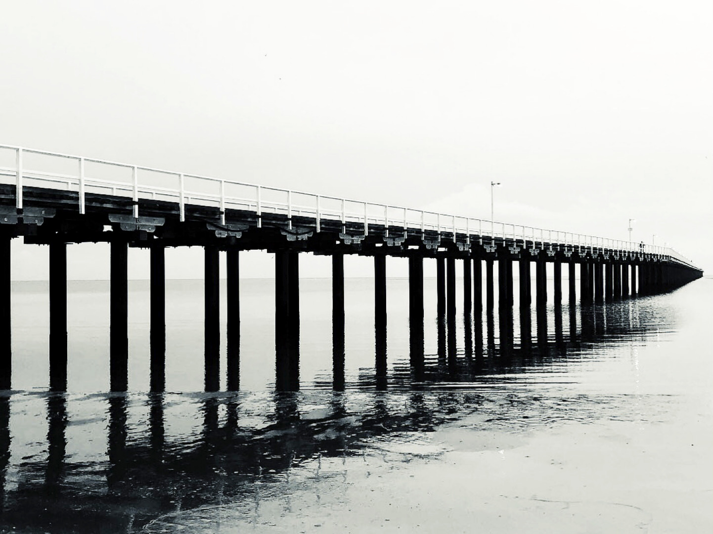
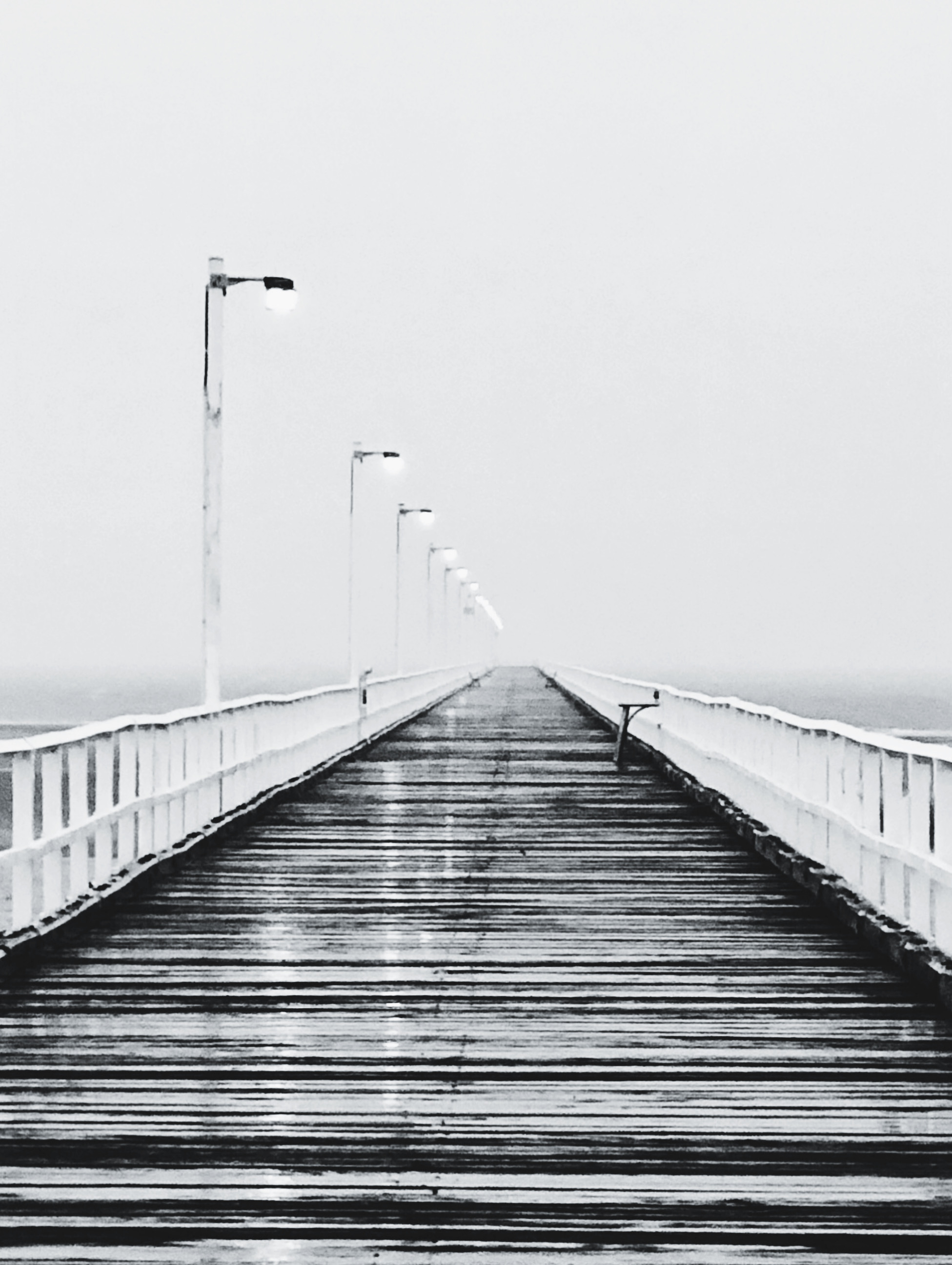
To be honest, these aren’t my favourite – they were all taken with slide film and are filed away somewhere. These are, however, the most recent and they weren’t taken as black and white, they were taken with my phone and filters applied to make them look black and white – to bring out the textures that you sometimes miss with colour.
Both pics are of the Urangan Pier at Hervey Bay. Both were taken on a rainy morning when the sky seemed to meet the sea and the pier felt as though it reached out forever.
Linking up with Terri at Second Wind Leisure for Sunday Stills.


Hi, Jo – Both pics are absolutely stunning, especially in black and white. I continue to learn a great deal from you – this time not about food or writing but photography. Thank you for this very interesting info.
There’s so much more of that in the book of useless knowledge.
Hi Jo, loved the photos and I’ve learned something about taking photos! I’d love to be more knowledgeable about photography. Having seen these photos I can now remember when we took the children to visit Hervey Bay when we first moved to Queensland in 1988. #SundayStills
There’s so much more where that came from in the book of useless knowledge that is tucked away in my brain.
Wowzer, your experience really shines through in your choice of black and white photos, Jo! These are frame-worthy (or canvas-print worthy) and would look spectacular on anyone’s 18% neutral walls 🙂 I really appreciate reading about your photography days. Now I remember why I didn’t get into photography BITD (I’m too impatient) and as you say, film costs a bomb to develop!
Thanks Terri. You had to be so patient and so selective about what images you captured. It’s so much easier these days.
Hi Jo, The photos of the Urangan Pier allow many options of colour and light. You remind me how my husband and I still discuss how we used to use various film and the expense to purchase and develop. The 18% grey topic is fascinating and how you ‘developed’ it in your story. xx
I loved your thoughts on SLR photography..my daughter took a photography class in HS and college, she graduated in 2014 using film cameras and loved it.
Well, I’ve kearned more about b&w photography in the last couple of days than I’ve known in my entire life. I think I still prefer colour, but nothing beats the ephemeral feel of b&w in certain pics. Loved both of yours x
Lovely photos!
Well you are one clever lady Jo! I didn’t know about the 18% grey rule and how you used it in your book 🙂 Great photos for the black and white prompt
There’s one for the useless book of knowledge.
Jo, I remember my dad using a card and talking about lighting. I hadn’t heard the 18% rule or remembered it anyway. Great use in your book. The perfect guy 18% gray. Great post. 🙂
Thanks Marsha, and thanks for dropping by.
Of course, my pleasure!
Beautiful. The gray really enhances the textures, the lines and shadows. Perhaps even better than black and white. The gray shades of the water in the first photo reads like a color, almost like a metallic gray-green-blue. Haunting.
Thanks!
It’s all very technical for me – I read your post twice over and I think I barely understand it. I’m afraid I’m still an iPhone point and shoot sort of person, but I really love Black & Whites. And yours are so lovely (even if they aren’t your favourites).
Lovely photos shoot.